Total Pageviews

Friday, 27 April 2012

Question 4) What have you learnt from your audience feedback?


I used Stuart Hall’s Encoder-Decoder model to create the Wonderland trailer, poster and the Exposure magazine cover. As the encoder I researched what our target audience expects from a trailer, poster and magazine cover then when I found that out I created the storyboard for what the audience wants and expects to see. When it went to filming I was involved in what needed to be shot and Callum Deeney was involved in how it needed to be shot, then when it went to editing Michael Fenton was involved in how it went together. This meant we all knew what our role was when creating the trailer and had a grasp on what the target audience needed from our job.

Wonderland Presentation for Audience Feedback:

We started with research, looking at trailers that fitted the genre we wanted to use and see the common conventions we could play with.  We then created a PowerPoint presentation that we showed to our target audience and received feedback from it. Originally we wanted to go with a trailer that mixed the dramatic world of Trainspotting with the fantasy world of Alice in Wonderland. People understood the plot of the film but came to the conclusion that the links to Alice in Wonderland were just there to fit in with the concept. So then we decided to scrap scenes where we introduced a mad hatter, a carving of a Cheshire cat etc. instead we decided to focus on the plot and the gritty drama that people seemed to like.

Mr. Morris' Audience Feedback:


When we created a draft we would upload it to YouTube and promote it on Facebook because the target audience for our film would use these social network sites. We received feedback saying the different locations were good and explained the plot of the story well but the length of the shots were too long for a trailer and needed to be shorter.

The main feedback we got was about the scenes, suggesting different angles and a voiceover to explain the story and make it clearer, which we took on board and used to varying degrees, based off of what we want to show and what they want to see. For instance, we received a lot of comments saying we explained the plot but didn’t give too much away but they had to focus on the scenes a lot to do that, so we did incorporate a voiceover into our trailer to explain the characters decision in the film.
The mode of address we wanted to portray was that of a fly on the wall. The audience saw the shots in the trailer as if they are there watching the drama and action happen in front of them. Our target audience has a grasp on drug problems in modern culture and so can understand the realism in a story told like this; creating a prospect of an entertaining, gritty and realistic view on drug culture. We did this by using shots that stood back from the action and just showed what other eyes would see.
When creating my poster I wanted the audience to gain information about the film, without revealing too much information. This meant that I didn’t want to show shots of scenes that would ruin the plot of the film but an image that would give the audience information about the characters. This received a lot of praise although people did notice the similarities between my approach and my inspiration, Trainspotting. I was concerned this would happen and I decided to alter colours and images to have differences that separated the two but still followed the same pattern.
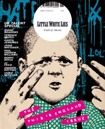
I wanted my magazines mode of address to have an informative approach. Giving the audience the information they need to know about the film with the entertainment elements there for all to see. I started this off with shots from the film to give the magazine the idea of going behind-the-scenes but audience feedback told me the still footage didn’t explain too much and was quite blurry. So I then changed to the idea of an interview with the main character and going in depth on his life and his opinion on the film. This got a better reaction as the shot was simple and anchored the text; people knew what they were going to read if they bought the magazine. The only problem the target audience had left was the colour of the magazine. So I changed that to more distinct colour to give impact to the cover.
Doing research without audience feedback will have limited success because you are only going off of what you and the people you work with thinks effective. Where as with audience feedback you can work on getting the best out of scenes, and plot to a film trailer and the images and text to put on a magazine cover and film poster.

Question 3) How did you use media technology in the construction of your research, planning and evaluation stages?

The Canon VIXIA HF R20 Flash Memory Camcorder is the choice we made for our film trailer. It is easy to use, has a high performance function and is good value. The advanced video snapshot lets you create 2, 4 or 8-second movie clips. The advanced but simple-to-operate control features of the VIXIA HF R20 help us create high quality video shots.
The simplicity of this hardware made it easy for the entire group to understand and use the camera when called upon to do so. When using the video camera we were able to play around with the scenes we had created and change the image of the storyboard. We were able to do this because of how portable the camera was and the quality of shots it could still pick up.
The Vegas Movie Studio Platinum Edition software has everything needed to produce spectacular HD movies. We used the Sony Vegas to edit all of our clips in the trailer. We needed to shorten clips and get them in an order that fitted with the storyboard created for our trailer. The quality of this software meant that we were able to play around with clips in the trailer with relative ease.
We needed to upload images that were commonly used in trailers, like the MPAA rating screen. The process was simple and easy to do. With the inclusion of this shot alone, it makes our video appear more valid to consumers because it is what they are used to seeing.
As well as the green rating screen, captions are commonly seen within a trailer and the audience are used to seeing captions to break up shots in the film. This software was easy to use for this process as it is common place in creating a film and Sony Vegas is used for film creations.
Working with footage we played around with the visuals and changed the lighting to work with shots that would fade out towards the end for another clip to fade in to shot. We wanted to have our trailer filled with drama and sadness and having the ability to change the lighting of shots gave us the opportunity to anchor meanings we wanted the audience to feel.
The Samsung PL200 is easy to use and has a large LCD and good photo quality for its class. The Samsung PL200's lens isn't as long or wide as competing models. It also has a pretty short battery life and requires a proprietary cable for charging. A simple ultracompact with a long lens, the Samsung PL200 isn't a standout, but shouldn't be overlooked either.
We used the Samsung PL200 to create our shots for our magazine and poster. With such a small camera it was easy to take whatever shots you wanted with relative ease. However, with no tripod it was hard to get a focussed shot. The camera was easy enough to use, it would have been better if we could have found a better camera with more attachments.
The design power of Corel DRAW offered me content-rich images and fonts, professional graphic design tools and photo-editing capabilities. Plus, the enhanced speed of 64-bit support allowed me to quickly process larger files and images. I used Corel Draw for my ancillary tasks by using the photos I took and creating a poster for advertisement and a magazine for publicity.
For my magazine I was inspired by Empire’s cover of Ewan McGregor so I used the protagonist as the main shot and created a similar layout that I was able to Google. With Corel Draw it was easy to recreate what I wanted but be able to put my own spin on the magazine cover. The only problem was that the colours used didn’t come out clear and when I thought I had purple it was really dark blue. I was able to correct this through Corel Draw and the software helped use the best of both magazines around it.
With my poster I was inspired by both Trainspotting and This is England. Corel Draw worked well because I could create the best of both worlds. I wanted to show the cast together, which was in both posters but with This is England they are all in one shot, instead of divided in Trainspotting. Corel Draw helped me create this poster and my image to get the best of both worlds.
I used Blogger to record all of the important information I wanted. This meant the research, planning and feedback that I considered useful throughout this process went up onto the blog. This website was very useful in recording the information I collected and wanted to refer to.
We used YouTube for research looking at trailers that compared with the image that we wanted of Wonderland. At first we wanted a clash between Alice in Wonderland and Trainspotting; to create a fantasy world within a gritty drama.


Facebook and YouTube were used to get audience feedback, when we created a draft of our trailer we would upload it onto YouTube and promote it off of Facebook. All of the people within my group have knowledge of how to use Facebook and YouTube so it seemed like the obvious choice of what to do.

Question 2) How effective is the combination of your main product and ancillary texts?

My Wonderland trailer and poster are connected through the advertising aspects of a production company trying to promote the film, where as the magazine is a collaboration between the film and magazine production company. The whole idea behind all three media outlets is to attract an audience to see the film. This means that we have to follow conventions, what the audience expects to see, but use unique aspects that will grab the audience’s attention. My inspiration was Trainspotting, so I wanted to create a dramatic trailer that explained the drug plot in the film and why our protagonist had taken the route he had. This made William Derry our most important asset, so I made sure he was in my ancillary tasks in one way or another. In the poster I made sure William was on the left and gave all the characters a name and number, so I could give William number 1 and he would be considered the most important. In the magazine I wanted William Derry on his own so that the audience could expect an in depth interview with him about his life and the movie; this means that he is selling the product as the main character just like in the trailer.


In the Wonderland trailer we wanted to introduce the audience to the characters, have captions with critic’s opinions on the film, show the audience what to expect from the film and give the films title to the audience. All of this is included in my poster; the audience can see the actors with the names of their characters, there is a caption with a critics opinions on the film, the rated 18 shows the audience what they should expect to see and the title of the film is clear for my target audience to see. This shows that my target audience will see the trailer understand the plot of the film and then see the poster and get to know the name of characters, or vice versa. With my Exposure magazine I wanted to introduce the audience to the actor William Derry, because in the trailer we were introduced to William Derry’s character. I wanted to show off William’s acting skills by allowing the audience to read an interview about him and see he is nothing like the character he portrays. This could only be done by creating differences between William Derry’s character in the film and William Derry the actor. Between the poster and magazine the only connections are William Derry. Like the trailer, William in the poster is William character, Daryl, and in the magazine it is William the actor, however in the poster he is supported by his cast and is just one of three promoting the film for advertisement, where as in the magazine promoting the film through publicity.

Question 1) In what ways does your media product use, develop, or challenge forms and conventions of real media products?

Genre Conventions:
Drama - A drama is a film that deals a lot with human emotions. They are usually very serious, tense and portray realistic characters, of which the protagonist is usually in conflict with themselves.
Romance – A romance is a film that deals with relationships. They are usually between two people, a man and a woman and portray one better off than the other, of which causes problems but resolves itself at the end.
Trailer – A trailer shows the key moments from the film accompanied by music, captions and voiceovers explaining the plot of the film and introducing the director and/or actors to the audience with the title of the film and release date near the end.

Poster – A poster has a large title, showing off the name of the film with a picture and colours that draws the attention of the audience accompanied with names of famous actors or director and persuasive language from critics to intrigue the audience.
Magazine – A magazine has a mast head for the name of the magazine, an image and colours to attract the audience with text to show articles and larger text to show main articles and possibly other images to accompanies these to attract an audiences attention.

By using the codes and conventions used in Trainspotting, the inspiration to my trailer, it’s easy to see we followed the path they took but made some changes to keep the trailer original for us and the poster/magazine original to me. Both trailers show key scenes in the play and explain the plot of the film. Trainspotting is dramatic-comedy and so explained there film with comedic scenes to entertain the audience, whereas our Wonderland film is a dramatic-romance and so our film explains the story with romantic scenes to entertain the audience. Trainspotting uses the main characters voice as non-diegetic sound explaining why he made his choices to take drugs with a positive spin, keeping it more comedic, whereas we use our main characters non-diegetic sound to explain why he chose to take drugs with a negative spin, keeping it more dramatic. Back when Trainspotting was released, there was no famous actor in the film and so they did not promote Ewan McGregor more than just the main character that is what we did with William Derry in our trailer, we kept everyone as notorious as each other and just focussed on who the main characters were.
In Trainspotting’s poster we see the title of the film, the cast, a critic’s reviews and a promotion to the director. I followed the majority of that but the cast in Trainspotting were separated for the photo and then photo shopped together again, where as in mine I wanted to show my characters together posing for the camera. Also a unique feature of Trainspotting’s poster was to have the characters names alongside there photos and I used that for mine to give the audience more information towards the characters.

Empire’s front cover of their magazine promoting Trainspotting shows the main actor in the film as their main article with text anchoring its purpose. I followed this example because it is the most common layout to a magazine main article. Empire magazine uses Ewan McGregor’s image and covers up their Mast Head because it is such a popular magazine people will still know what it says, the magazine I have created is not as popular and so needs its name to be seen because it is still growing in popularity.